Welcome to the Self Help Africa visual identity extranet. The guidelines contained here, along with the wide range of downloadable graphical resources, should assist designers and non-designers in the creation of consistent and well-executed visual communications on behalf of Self Help Africa. Should you have any enquiries, or should you need access to our library of photographs on Smug-Mug, please contact us by clicking here.
Logo
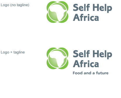
The Self Help Africa logo comes in two forms - without tagline and with tagline. Where possible the logo should be used with tagline. The logo should not be altered in any way. For clarity, our logo shlould always appear against white, except where it is to be used as an endorsement logo on a medium, dark coloured or textured background, in which case it should be used in single colour.
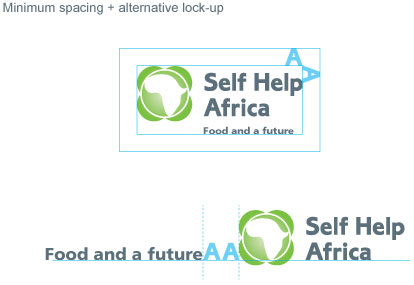
When placing the logo in relation to other graphic elements, please ensure that you give it minimum spacing of one "A" height as shown here.
You may find it useful to create an alternative lock-up of logo + tagline for certain situations. As shown here, the tagline has been arranged on the same typographic baseline as the word "Africa" in the logo. The tagline is then placed at a minimum distance of no less than two x "A" widths from the logo. Ideally, the tagline should not be larger in typesize than the type within the logo.
You may find it useful to create an alternative lock-up of logo + tagline for certain situations. As shown here, the tagline has been arranged on the same typographic baseline as the word "Africa" in the logo. The tagline is then placed at a minimum distance of no less than two x "A" widths from the logo. Ideally, the tagline should not be larger in typesize than the type within the logo.
[ Top ]
Typography
PRIMARY TYPEFACE
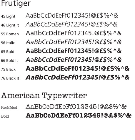
Frutiger has been chosen as our primary typeface, for its clean and compemorary design which adds clarity and legibility to our visual communications. It should be used when typesetting large blocks of body copy. It is also suitable for headings and fine print. Frutiger comes in a diverse range of weights and styles.
Frutiger can be purchased at www.fontshop.com
SECONDARY TYPEFACE
American Typewriter has been chosen as our secondary typeface, as a support to Frutiger. American Typewriter has been chosen as it has greater visual stand-out when used in headings and pull-out quotations. Its design is more analog than digital in look, which in some way reflects the reality of the lives of the people who Self Help Africa works with. Avoid over-use of American typewriter in your desigs, particularly avoid using it in large blocks of body copy and small print.
American Typewriter can be purchased at www.fontshop.com
ONLINE/OFFICE TYPEFACES
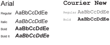
When creating online communications (websites or emails), or when preparing correspondence (MS Powerpoint or Word documents), we suggest that you use Arial or Courier New as a substitute for our primary and secondary typefaces.
When creating online communications (websites or emails), or when preparing correspondence (MS Powerpoint or Word documents), we suggest that you use Arial or Courier New as a substitute for our primary and secondary typefaces.
[ Top ]
Colour
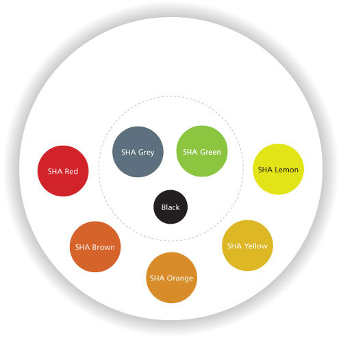
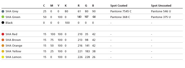
Our colour palette consists of two groups of colours; primary colours and secondary colours.
Our primary colours are:
To energise and bring a sense of diversity to our visual communications, we have introduced a group of secondary colours to our colour palette.
Our secondary colours are:
These colours should only be used in addition to our primary colours. ie. Ensure that SHA Grey and SHA Green have been used before applying any of our secondary colours.
Black and White should always be considered when creating Self Help Africa visual communications. Black works well within body copy and adds to the clarity and stand out of a design. White (or negative space) brings a sense of light and openness to our visual communications.
Our primary colours are:
- SHA Grey
- SHA Green
To energise and bring a sense of diversity to our visual communications, we have introduced a group of secondary colours to our colour palette.
Our secondary colours are:
- SHA Red
- SHA Brown
- SHA Orange
- SHA Yellow
- SHA Lemon
These colours should only be used in addition to our primary colours. ie. Ensure that SHA Grey and SHA Green have been used before applying any of our secondary colours.
Black and White should always be considered when creating Self Help Africa visual communications. Black works well within body copy and adds to the clarity and stand out of a design. White (or negative space) brings a sense of light and openness to our visual communications.
[ Top ]
Embellishment
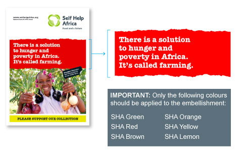
We have introduced an embellishment to our communications. It is simply a colour area with a torn edge, which should be used to house headline text or pull-out quotations. It brings a sense of energy, ruggedness and distinction to our visual communications. We advise that this embellishment should be used sparingly, and preferably on cover pages only. The artwork is available as a black BMP image, to which you can apply colour in your document.
DOWNLOAD EMBELLISHMENT ARTWORK
Click here to download
DOWNLOAD EMBELLISHMENT ARTWORK
Click here to download
[ Top ]
Imagery
We have a huge archive of photographic imagery which has been compiled over a number of years. All imagery is available to download on our SmugMug page (contact us for login details).
Key to the success of our visual communications lies in which images we select, and how we use them.
To assist designers in selecting approprioate imagery, we have created two categories of imagery as follows:
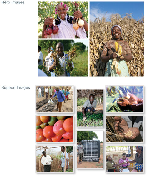
HERO IMAGES:
SUPPORT IMAGES:
Key to the success of our visual communications lies in which images we select, and how we use them.
To assist designers in selecting approprioate imagery, we have created two categories of imagery as follows:
HERO IMAGES:
- Hero images are typically be used on cover pages or as main images in posters and exhibition displays
- Hero images generally show African (farmers) actively solving their problems
- Hero images connect with the audience (eye contact & faces to camera)
- Hero images are high quality images (properly exposed and in focus)
- Hero images feel positive and upbeat (Smiles)
- Hero images do not contain any montage or photo-manipulated elements
- Hero images should be accompanied with a ID label which introduces the person in the photo and informs the audience about their situation. Click here to find out about ID lables
SUPPORT IMAGES:
- Support images illustrate or support a point of information within our message
- Support images may be combined with other support images to create a montage
- Support images may contain close up details of people, places or objects
- Support images contain multiple focal points, with lots of activity taking place
- Support images can be presented as 'snapshot' type images (as shown here) with photo borders and drop shadows
[ Top ]
Additional items
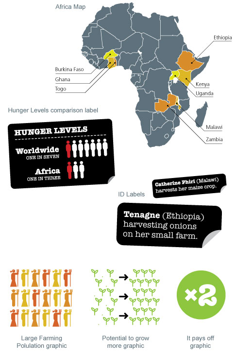
Shown here is a selection of additional graphic items which you may find useful to help express a particular point of information in your communication.
[ Top ]
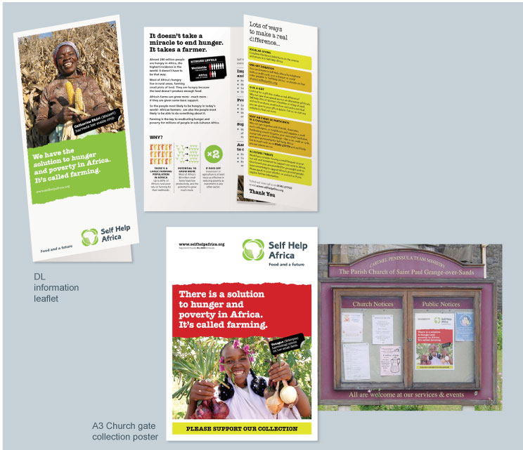
In Action
Below are two examples of a leaflet and poster which we created using the refreshed visual identity. These should give you a sense of how to combine the visual identity elements and maintain a degree of consistency across all communications.
[ Top ]